
Mobile commerce is continuing to grow, and there are now plenty of compelling reasons why retailers should sell via mobile.
There are more barriers than in traditional e-commerce, such as smaller screens, variable connections speeds, so if retailers are going to make mobile commerce work, then user experience is all important.
With this in mind I've compiled 25 tips to help maximise conversions from mobile commerce...
Start with a mobile site
There are some great mobile commerce apps around, but a mobile site offers more advantages to retailers.
A mobile site can appeal to customers across a variety of phones, it can attract the mobile searcher rather than relying on customers seeking out and downloading an app.
Having a mobile site allows you to benefit from links, and makes it easier for people to share URLs of product pages. There are other reasons too: the growth of Android, the increased sophistication of mobile sites and more...
If you do opt for an app, provide the wow factor
Plenty of major retailers opted for an app over the last couple of years, and this was often based on stats showing a high percentage of mobile visits from iPhones.
It can be the case that apps are intended for increasing engagement with existing customers, while a mobile site is there to appeal to new and old.
If retailers opt for an app, providing that wow factor can really help your app to stand out, by allowing customers to do things that aren't so easy via the mobile web.
For example, the Debenhams app contains a barcode scanner, which makes for a great price comparison tool, but also allows for the use of QR codes.
Redirect mobile searchers to the mobile version of your site
Unless they already have your mobile site's URL bookmarked, mobile users will come to your site through via search. Redirecting users to the mobile optimised version make it much easier for them.
Provide a prominent search box
The site search box offers a useful shortcut for mobile users. If they know what they want, then a clear search box allows them to go straight there.
Site search can be more significant on mobile sites and apps, where browsing can be time consuming.
Add autosuggest
Entering search terms via mobile can be a fiddly business, and users will make mistakes. Any tools that can help them correct these mistakes easily will reduce potential frustration for customers.
Providing suggestions as users type. or suggesting alternatives on search results pages can solve the problem.
Provide the same range of stock as the main site
Users expect to be able to access the same range of products from their mobiles as they would from their laptops and PCs.
Don't make registration compulsory
Barriers to purchase should be avoided in mobile commerce, as every extra step means more time and more hassle for users.
Making users register before checkout means that they have at least three or four more fields to fill in, when much of the information will be asked during the payment process anyway.
Make it nice and easy for existing users to make a purchase
This is a big part of the reason why both Amazon and eBay have such impressive mobile sales figures.
One you have a login, then actually making a purchase just takes a couple of clicks. In the case of Amazon, it already has my payment details, while for eBay I just have to enter my PayPal username and password.
There is no need to enter address and credit card details, just to confirm the information already stored via your account.
While not every e-commerce site saves customer payment details, those that do are better placed to attract repeat business from mobile users.
Offer alternative payment methods
Following on from the previous point, the addition of PayPal and alternative payment methods such as Google Checkout can help in two ways.
- These payment options can help to reassure customers that are concerned about entering their card details via mobile.
- Since PayPal stores customers' address as well as payment details, the payment process is reduced to entering the username and password.
Good product filters are a must
If users expect to see the same range of products on mobile sites and apps as are available on their desktop counterparts, then they need to be able to filter and sort effectively so that browsing is made easier.
Lack of effective filtering options can make for a very poor user experience on mobile, making more work for the user.
For example, while the HMV iPhone app is otherwise well designed, the lack of filters is a letdown. For example, in the music section, there are thousands of CDs on offer, but no way at all of narrowing that search:
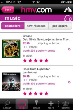
What HMV should have done is to provide multiple filters, such as music genre, customer review rating, date of release etc so that shoppers could reduce the number of items to look through to a more manageable number.
Photos need to be used effectively
Just because users are working with a smaller screen, it doesn't mean the basic stock photos will do.
People still need to make an informed decision about a purchase, and photos are an effective method of answering customer queries about a product.
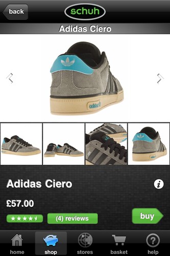
In the example from Schuh shown below, users can see the trainers from various angles to get a great idea of what they look like.
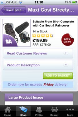
Show delivery details on product pages
People want to know how much delivery costs, yet many of the mobile sites and apps I have reviewed neglect to add this information.
This means that users have to start the checkout process to find out this information.
Keep page loads to a minimum
Mobile devices and websites are getting better, but retailers developing mobile commerce sites still need to account for the fact that users may have variable connection speeds.
With a slow connection, every extra page load or refresh means more time spent waiting, and more frustration.
There is a balance to be struck here: while users want a mobile experience that is close to the main website, they also want a simple site that works quickly (they want it both ways).
Keeping the number of steps involved in selecting and paying for products to a minimum is important, as well as keeping page sizes down.
Don't send users to non-mobile pages
Some otherwise decent mobile apps and sites have spoiled the user experience by sending shoppers to pages which haven't been optimised for mobiles.
If you are going to design a mobile site or app, make sure that at all of the pages provide the same user experience.
For example, while users can find their local store, browse the product range and add items to their basket on the Next iPhone app, users are sent to a checkout that hasn't been optimised for mobiles.
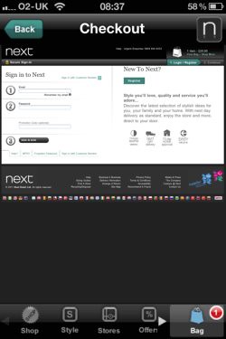
If a user has shown an intent to purchase by entering the checkout process, it is foolish to risk that sale with a non-mobile checkout.
Offer phone contact alternatives
However well designed a mobile commerce site may be, there will often be some customers who want to seek reassurance about a purchase, or who may prefer to complete the transaction by phone.
Since they are on the phone anyway, providing a clear contact number means customers may get in touch rather than abandon the purchase.
Get listed on mobile comparison services
Even if you don't have a mobile site, you can at least attract some sales from mobile users via mobile comparison services such as Sccope.
However, if you are serious about converting traffic from comparison sites, then a mobile optimised site is essential.
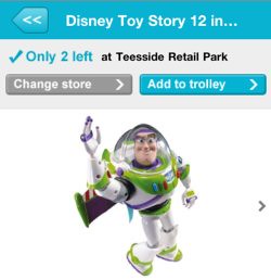
Provide store locators
Stats on mobile commerce usage suggest that store locator tools are amongst the most popular pages on sites and apps for users.
They are a great way to get customers into the store and provide information about stores and directions. Even better if used alongside a reserve and collect option, as with the Argos app.
Provide alternatives to mobile checkout
Some customers may still have security concerns about making purchases on mobile, or perhaps they prefer not to go through a fiddly checkout process.
Whatever the reason, providing alternatives means potential sales do not have to be lost.
Alternatives could include:
- Reserve and collect in store.
- A phone contact option.
- Cash on delivery - useful for takeaways.
- Saving items to a wishlist.
Keep design simple, but not too simple
This is a bit of a paradox, but there is a balance to be struck between making the site simple to use and quick to load, while still retaining as much functionality as possible.
Kiddicare's mobile site and iPhone app are great examples of this. Users can browse the entire product range, yet navigation is still simple.
Also, Kiddicare provides features such as reviews and videos to provide a richer experience for mobile shoppers:
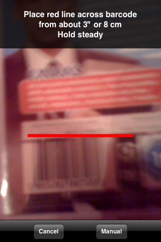
Make price comparison easy
Another common use for mobile commerce sites is to allow offline shoppers to compare prices.
There are already dedicated apps for this, such as Sccope, but if retailers can get users doing this within their own apps and sites, then they can benefit from this.
Making it easy to search for items within the app, and using time-saving tools like barcode scanners are one way to make this easier for customers.
Give local information where possible
Retailers should make as much use of location-based tools as they can to appeal to users who are shopping locally and looking for particular products and services.
This includes providing store locators, using mobile AdWords, and offering customers information on stock levels in their nearest shop, as Argos does:
Look at your mobile search strategy
Mobile search is growing fast, and retailers with mobile sites are best placed to take advantage of this traffic.
Retailers can include search terms related to location in their keyword research and target local searchers with mobile AdWords.
Nice big calls to action
Make your calls to action stand out on the smaller mobile screen by using size and colour effectively. Make it obvious.
Provide shortcuts during checkout
Little things like using the billing address as the delivery address will make the checkout process more palatable for mobile users, and using a postcode lookup tool will save users time spent entering their full address.
Provide collect in store options
Reserve and collect works, and retailers like Halfords and Argos have managed to boost multichannel sales by offering this service.
If this can be incorporated into mobile sites, it is an excellent method of attracting extra sales from offline shoppers, though the time between reservation and collection needs to be kept to a minimum.
Jose María Corbí
¡Calidad y Eficiencia Para Su Publicidad En Internet!


No hay comentarios:
Publicar un comentario